
Why Web Typography Matters Pt. 1

Fundamentals of web typography
As designers, one of our greatest tools is Typography. It is the primary vehicle we use as designers to communicate, inform or educate. Good typography gives character and life to words; narrative and excitement to paragraphs; importance and emphasis to headlines. If the typography is bad, so will be the design. When it is done correctly, it is powerful. Through typography, we are able to communicate our message and create a tone, mood, and tenor to the design. With typography we can grab readers and pique their interest.
We’ve all written something we wanted someone else to read, but have we ever considered what that person’s reading experience would be? One of the main purposes of design is to entice and delight, but in order to effectively grasp the readers’ attention we must first understand how we read, and what affects the reading process. Here are some things to consider.
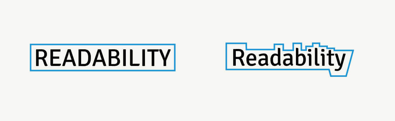
Readability
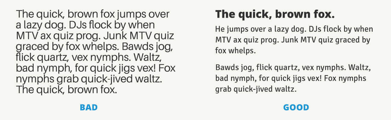
Just because something is legible that doesn’t necessarily mean it’s readable. Legibility means text is easy and clear enough to read. Readability combines the emotional impact of a design with the amount of effort it presumably takes to read and understand.
Saccades and Fixations
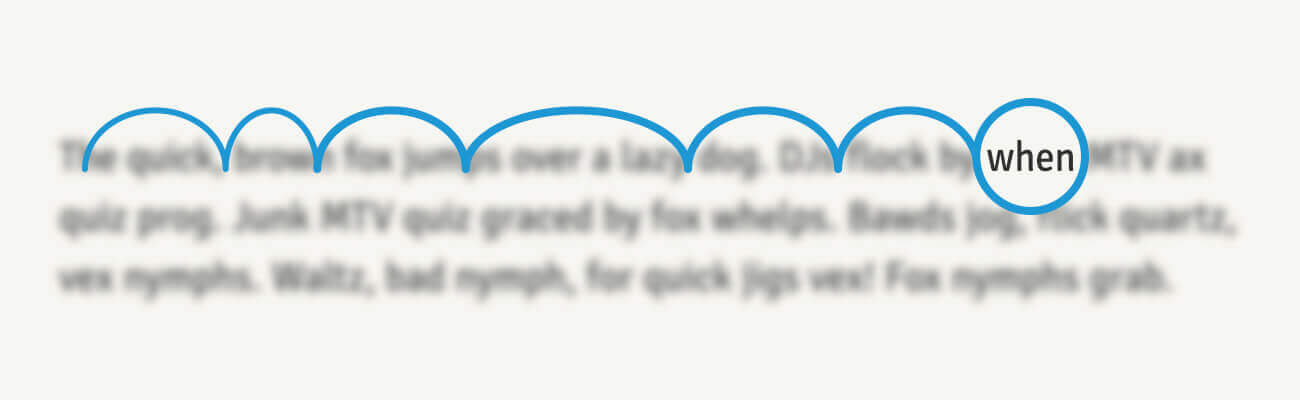
Reading isn’t a simple linear process. Instead, our eyes perform a series of back and forth movements called saccades, or really really fast hops across lines of text. Sometimes it’s a big hop; sometimes it’s a small hop. Saccades help us understand a lot of information in a short amount of time. The length of saccades depends on the proficiency of our reading ability and the familiarity of the topic.
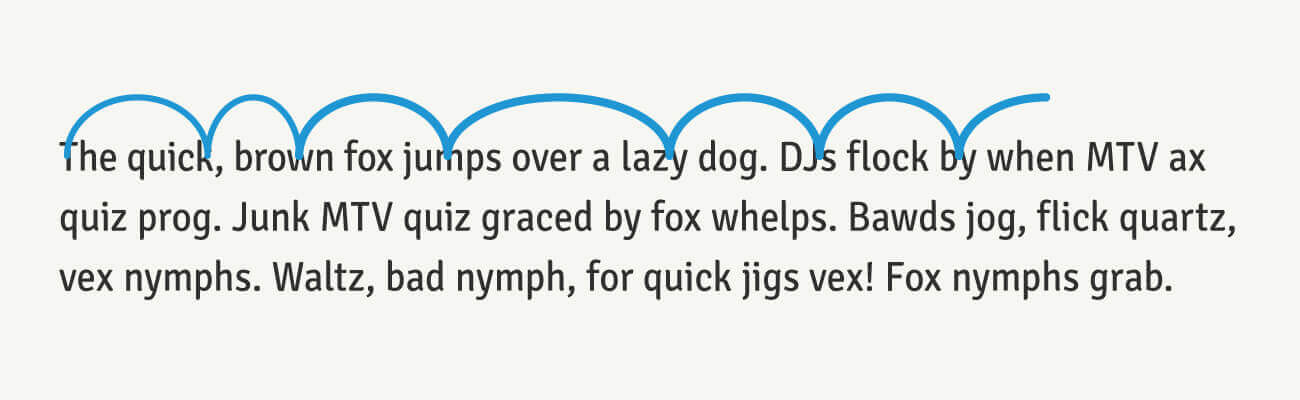
Between saccades our eyes stop for a fraction of a second, this action is called a fixation. When our eyes stop in these fixations, a couple characters become clear and focused while the rest of the text becomes blurred out. Similar to how the aperture or focus works on a camera.
Letter Contrast & Texture
If you take an average line of text and cover the top halves of the letters, it becomes very difficult to read. But if you do the opposite and cover the bottom halves, you can decipher the text and read without much effort. This happens because letters carry their identifying characteristics on the top halves. These unique characteristics applied together create contrast and the whitespace between each letter and characteristic is considered texture.
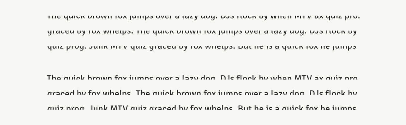
If you look at a line of All Caps letters you can somewhat decipher the line, but try reading a paragraph in all caps. It is very difficult. This happens because there isn’t much contrast or unique characteristics between them and the texture and whitespace around them is minimal. The word shape unfortunately becomes a plain rectangle.
Conclusion
As designers, the choices we make with typography can have a great impact on the reader. Understanding how we read and what affects our reading process is an important skillset. These fundamental skills can aid in pairing the proper typefaces for any design. The smallest details of a typeface such as size and spacing, weight and styles, contrast and x-height, special characters and ligatures only to name a few, can have great advantages for readers. When the reader doesn’t notice these typographic choices, we’ve done our job.
Stay on the look out for Why Typography Matters Pt. 2, where we look into typographic choices, pairing typefaces, and messaging with typefaces. Make sure to subscribe to be notified.