
Design & Experience | Brand
Redsson Rebrand
Expertise
Industry
Tactics
Overview
Our primary objective was to simplify and rebrand Redsson’s identity and streamline what they offer their clients.
Reddson is a provider of solutions that help organizations streamline complicated manual processes and improve efficiencies. But, the brand lacked an online presence, making it difficult for potential customers to find them, and needed a complete brand and website overhaul in order to increase leads and opportunities. At the start of 2020, SmartAcre® partnered with Redsson to help them consolidate and build their brand, develop marketing strategies for lead and demand generation, and increase revenue.
![]()
Challenge
We recommended updating their branding and the messaging that organized Redsson’s solution offerings to help them to stand out from the competition.
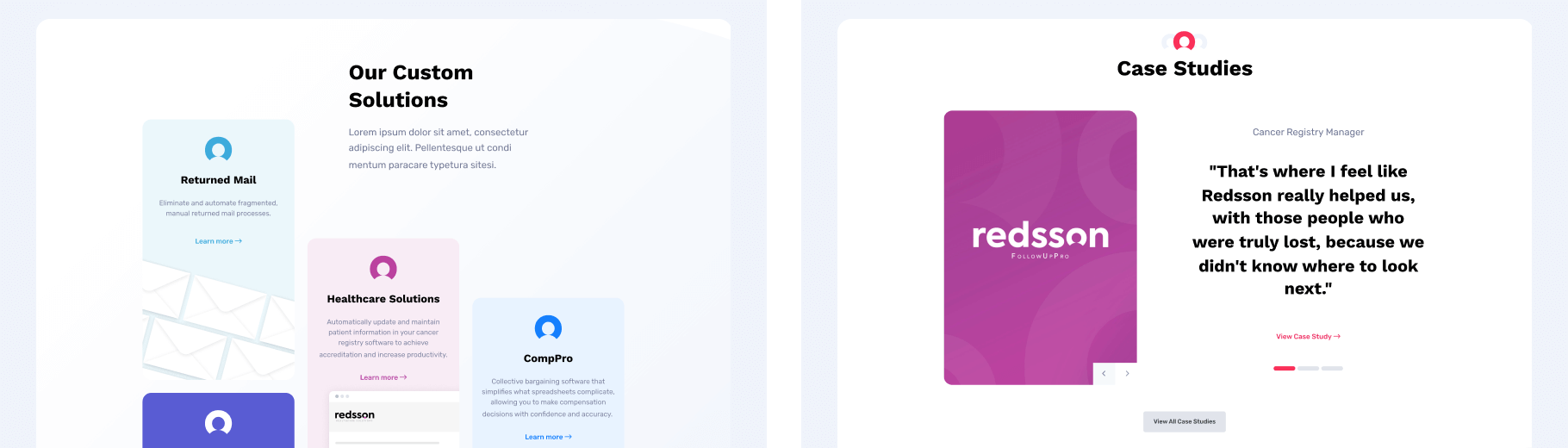
Redsson’s products and solutions cover a variety of personas, so we needed to match each to unique branding. Additionally, the website’s architectural sitemap needed to be improved so that each persona could find the right solution for their needs. Redsson’s rebranding and new navigation structure were challenging to implement, as was its taxonomy overhaul.
![]()
Approach
Brand Strategy
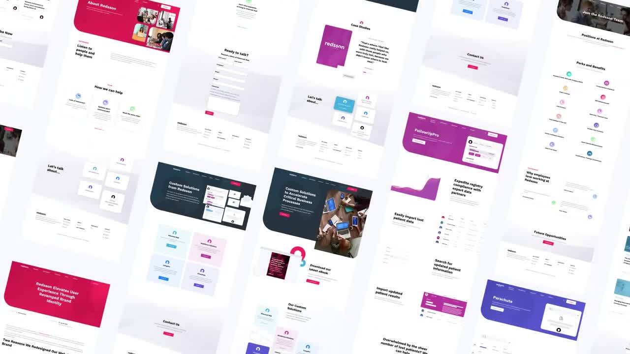
In order to provide clear and concise messaging and bring all of Redsson’s solutions under one umbrella, we developed a plan for the design, development, and launch of a new website.
To kick off the project, we conducted client interviews, reviewed competitors, and evaluated existing analytics. These findings were compiled into a website strategy document, which provided the requirements and recommendations for the entire project. Simultaneously, we began developing updated branding to provide Redsson with a new look and feel that would provide consistency across all of their solutions.
Logo
Redsson’s custom logotype was built with readability in mind and utilizes the Circular Font Family. The horizontal logo is Redsson’s primary logo. The icon represents the story behind the company: reading as “Red’s son”, we wanted to incorporate the subtle visibility of a person’s silhouette within the logo and the icon.
![]()
![]()
![]()
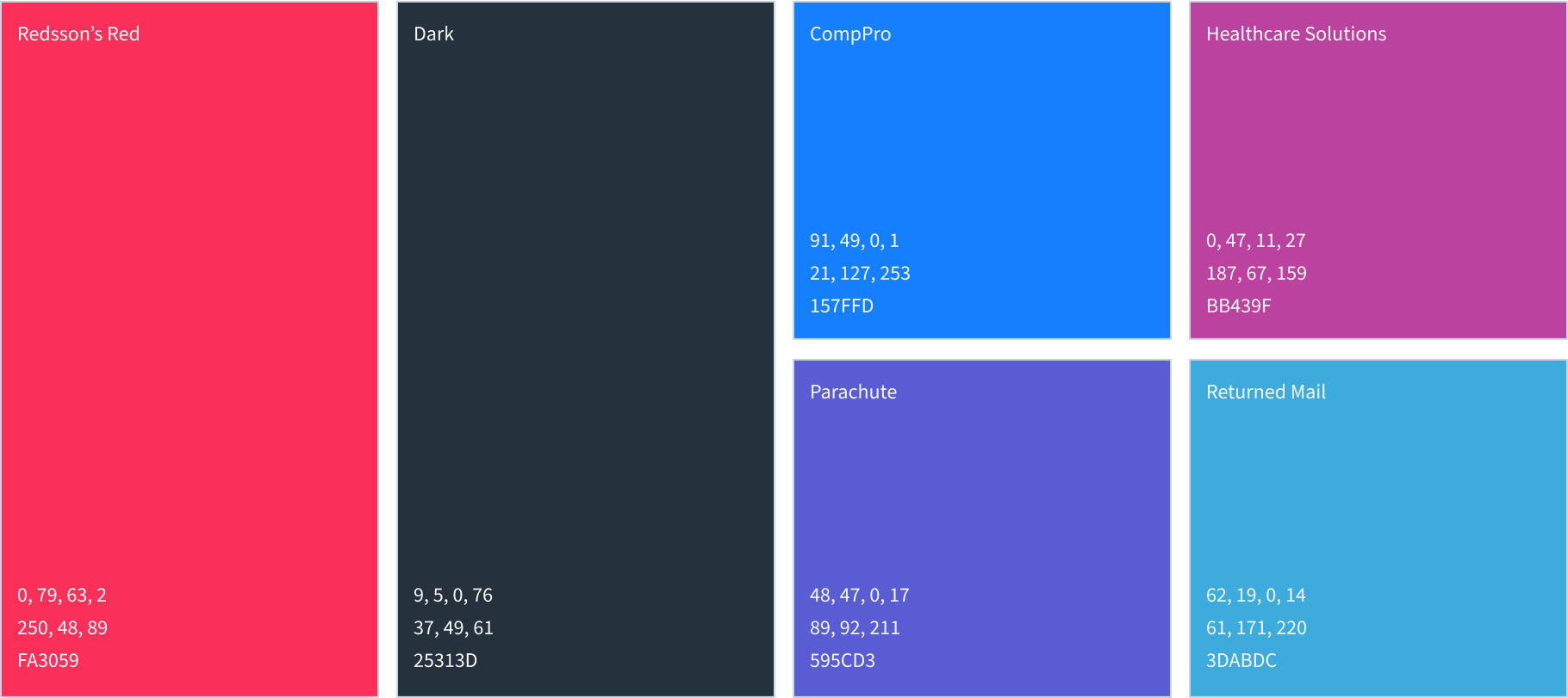
Product Logos
A complementary color palette was needed for Redsson’s product sub-brands, but the initial logo had to be kept intact. We seamlessly incorporated a type treatment under the main logo to distinguish the different sub-brands.
![]()
Visual Language
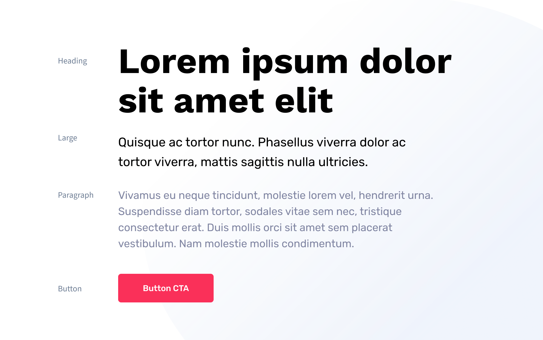
Vibrant, bold colors create a visual language that attracts attention and leaves an impression on the viewer. Featuring energy, vibrancy, and a modern feel, it appeals to individuals seeking excitement. Redsson takes advantage of various colors for their individual solutions, providing familiarity with the logo, but a color-coordinated experience.
Typography
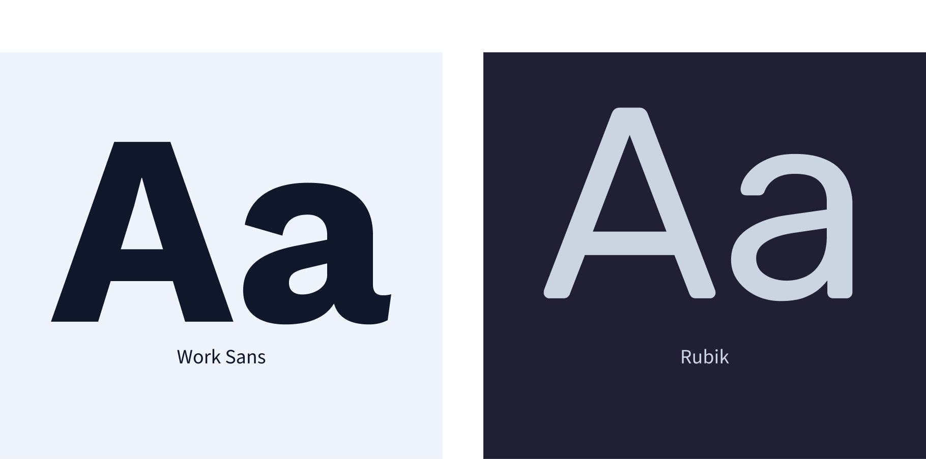
The primary typeface for Redsson is the Work Sans font family, a bold and assertive typeface used for headings and displays. The Rubik font family serves as a secondary typeface and is utilized as the main body content in both web and print collateral.
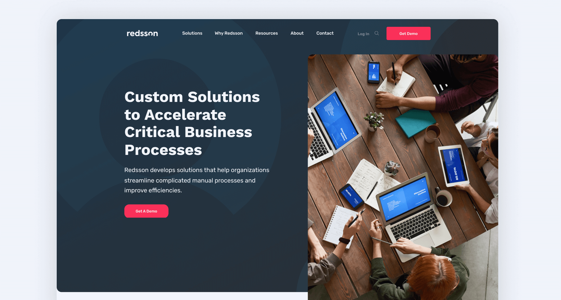
Interactive
A big component of this rebrand was the website redesign. This plan focused on improving the design, messaging, user experience, and technology (including HubSpot) while providing a more accurate representation of the brand across mobile and desktop. At the time, all of Redsson’s solutions lived in their own specific domains. By bringing them all under one website, SmartAcre could better run and complete campaigns.
Outcomes
231%
Increase in unique page views
68%
Increase in average time on page
69%
Increase in site speed using google speed test
- Redsson’s solutions are now consolidated under one unified brand via one web property
- While consolidating solutions, SmartAcre was able to help improve the overall health of the Redsson website according to SEM Rush’s Site Health Score*
- Improved brand messaging on a single site helped increase numerous metrics, including an increase in unique page views, average time on page, and % exit
- The site was also developed with Google in mind. The overall site speed improved from an average speed of 54.5 to 93 (out of 100) according to Google’s PageSpeed Index
*The Site Health score is based on the number of errors and warnings found on your site and their uniqueness.
Post-Project Success
Using data and best practices to develop a robust strategy, SmartAcre was able to provide Redsson with a single web property that reflected concise, updated branding with precise messaging. With a website and new branding at their fingertips, Redsson can focus on attracting new leads and moving them through the funnel.
Related Case Studies
SmartAcre Rebrand
Our proven methodology is designed to include marketing best practices, user experience, online visibility, and smart development.
Investment Metrics Rebrand
Our primary goal was to modernize the client's appearance to set them apart from competitors, while also improving the user experience and driving more qualified leads.
One10 Marketing Playbook
One10 partnered with SmartAcre to create a Marketing Playbook, empowering their marketing team to execute campaigns strategically, align with sales, and enhance multi-channel engagement.
Where We Start
Book a strategy session and we will discuss your unique challenges. For free. Maybe one day you will have a success story to add to this page.