How to Go Above and Beyond, Above the Fold

Summarize this insights post with:
8 Tips To Ensure Your B2B Website’s Prime Real Estate Is Optimized
The term “above the fold” refers to content on a webpage that is seen by visitors right away, sans scrolling. It harkens back to the age of print when newspapers needed to (and still do) prioritize headlines that appear on the face of a folded newspaper. Commonly, this content is also referred to as a “hero” or “A spot” as we call it at SmartAcre®.
__
#1: Write a concise but effective heading.
#2: Use visually impactful imagery.
#3: Resolve image resolution issues.
#4: Consider readability and responsiveness.
#5: Stay true to your brand.
#6: Avoid the “false floor.”
#7: Employ proper calls to action.
#8: Make it move.

Introduction
Did you know nearly 60% of viewing time on a webpage is spent above the fold? This finding, from a 2018 study, is actually a smaller percentage than what was found in a similar study done back in 2010, which found that 80% of viewing time is spent above the fold. While there has been a trend towards users being more likely to scroll than they used to be, Nielsen Norman Group remarks that “the pattern of a sharp decrease in attention following the fold remains the same.”
Of all the content you generate for your website, none is as prominent as the above-the-fold content. It is the very first thing visitors see when they arrive. As the saying goes, “You only have one chance to make a good first impression.” That impression could be the difference between an engaged visitor and a lost opportunity. A great A spot encourages visitors to scroll through and explore the website. HubSpot warns that “If it’s not properly optimized, you’ll likely see a boost in bounce rate and a decrease in conversions.”
So, what’s a clever marketer to do? Read on for helpful tips and best practices to implement in the A spot of your website to leave your visitors with a positive impression and entice them to get scrolling!
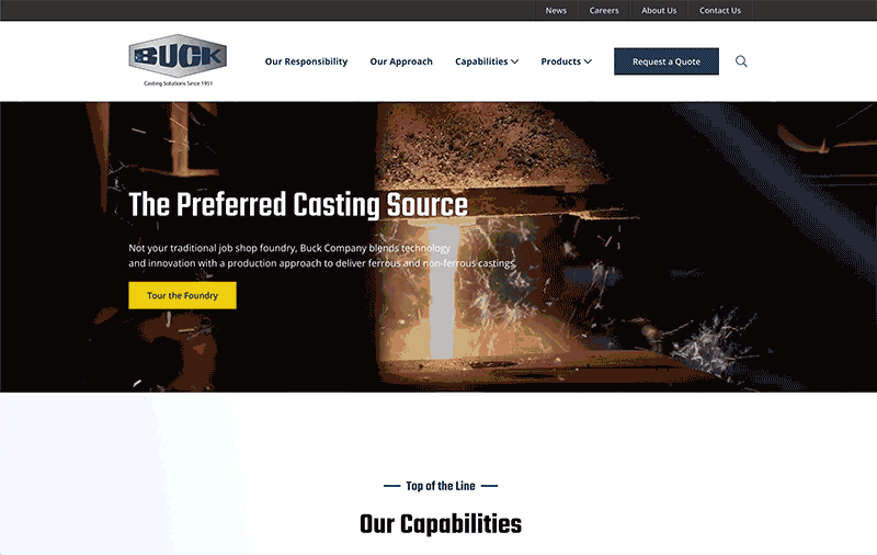
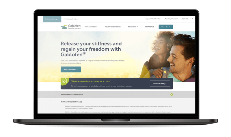
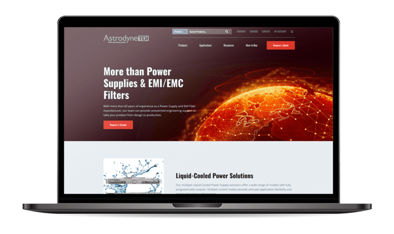
#1: Write a concise but effective heading.
Heading copy used above the fold should be short and memorable. Aim to come in at 10 or fewer words. In many instances, a clear value proposition should also be included as a slightly longer subheading. However, maintaining hierarchy between the heading and subheading is of utmost importance. A long sentence of text screaming at visitors as soon as they reach your homepage is not going to entice them to read, let alone scroll for more.
With such a strict word count, make sure the copy is carefully curated to send the right message with the right tone of voice. For the homepage, hero copy should give visitors a clear understanding of what the company is all about, who they cater to, and the benefits of doing business with them. A great place to start is to answer the questions WHAT, FOR WHO, and WHY. Great headings help visitors determine at least one of these. For example, “Free POS Software for small businesses” succinctly answers both what and for who. Marketing automation platforms, like HubSpot, can also provide the opportunity to personalize or incorporate “Smart” content to get even more out of your real estate by tailoring a header specifically to a prospect by industry, location, or other key demographics.
Be cautious of headings that are too vague and without substance. Marketers love to use sophisticated buzzwords that sound great but mean very little. It is usually best to avoid words like “passionate” and “innovative” within header copy. Take this header for example: “Driving Innovation To Change the World for Good.” Sounds great, right? But what does this actually mean? Phrases like this add no informational value and do not help visitors understand the business on a deeper level.
#2: Use visually impactful imagery.
While great copy appeals to your visitors minds, great imagery appeals to their senses. It takes mere seconds for humans to form opinions. In fact, research shows that 1/10th of a second is all it takes. With such instant judgements made, it is imperative that imagery be pleasing to the eye when scanned at a glance. Tactful use of imagery can both strengthen the hero section’s message and improve a visitor’s initial impression of the website. Make sure the imagery used in the hero section is aligned with the header copy and evokes the right mood. Choose visually simple images with one clear focal point. If possible, opt for custom photography rather than stock images. Remember–this first impression is an opportunity to be unique and tell a story. Visitors should be presented with a clear, simple message that compels them to keep diving deeper into the website.
#3: Resolve image resolution issues.
What’s the point of an awesome graphic if it is pixelated, or takes minutes to load? Image resolution is an important balancing act to navigate throughout entire websites. Full-width A spot images can be particularly tricky. Make sure the imagery you plan to use above the fold comes in a high enough resolution to look crisp while also loading quickly. According to HubSpot, “The ideal size for a full-screen hero image is 1,200 pixels wide with a 16:9 aspect ratio.” However, in cases where extra importance is placed on having crisp images, a width of 1,800 pixels is acceptable. Note that site speed may be impacted for some visitors. Also consider that mobile devices comprise a large amount of website traffic and must be taken into account. HubSpot remarks that “The ideal size for a mobile hero image is 800 x 1,200 pixels.”
When in doubt, start large and work your way down. Images can always be downscaled to smaller dimensions but can never be made larger without losing quality. There are image compression tools (we like TinyPNG) that can be used on websites to ensure file sizes remain manageable. Along with the target dimensions listed above, also aim for images that are under 1 MB in size.
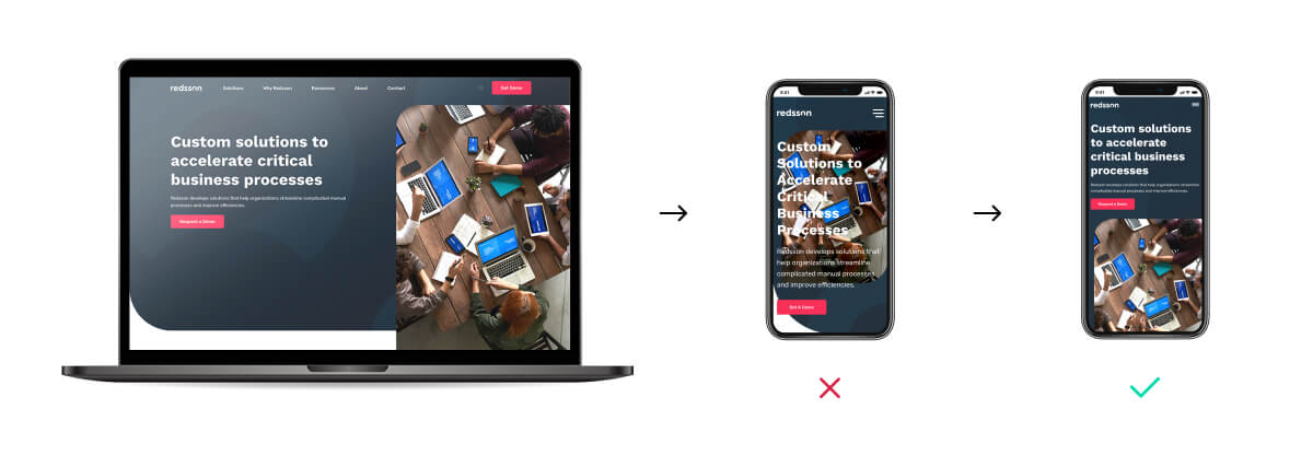
#4: Consider readability and responsiveness.
With mobile devices becoming an ever-increasing source of website traffic, make sure your above the fold content (and entire website) is appropriately responsive. Ensure that elements reformat to accommodate a range of different screen sizes both vertically and horizontally. Hero images are usually coded to scale automatically to the width of the screen while text is re-flowed so that lines “break” at appropriate places so that text remains visible regardless of screen size.
While header text may look great on top of a portion of an image on desktop, a collapsed mobile A spot may place text on top of busy or poorly-contrasting parts of the same image, reducing the readability of the header text. Consider using alternate images for mobile when these situations occur. A simple solution for this is to experiment with repositioning or adjusting the brightness of the image to be sure your header text is readable on mobile. Another option may be to separate the text and image into separate, stacked elements on mobile. While more dramatic changes can be made as well, it is important that the overall message remains consistent on both desktop and mobile. Here at SmartAcre, we can help create customizable A spots that allow different images to be selected based on screen size.
#5: Stay true to your brand.
It is essential for above the fold content to be tailored to suit your target audience. As the part of a website that provides visitors with a first impression, the mood that it evokes and the visual cues that it employs need to align with overall brand style. The hero section should give visitors a taste of what they can expect from the rest of the page and website as a whole. If brand voice dictates remaining informational and objective, write content and images that follow that direction. Likewise, if fun and informal verbiage is called for, try to also push imagery in that direction (see Tip #8) so that the content is working together toward the same message.
#6: Avoid the “false floor.”
We’ve already established that above-the-fold content is important. But we also know that there is valuable content sitting below the fold! Help your visitors to explore this content by avoiding elements on a webpage that might be interpreted as a “false floor”– a place where content appears to end but actually continues. Include visual cues, such as a down arrow, in your hero section that let visitors know that they should scroll down to find more content.
Design elements that are often interpreted as a false floor include hero sections that fill the entire viewport, prominent full width divider lines, excessive vertical negative space, and intrusively placed ads. While it may look sleek and trendy to have a strong hero section take up the entire screen, these attention-hogging design features often keep visitors from scrolling down and engaging with a webpage further. Instead, allow some content below the hero section to sit partially above the fold. This simple change makes a huge difference in subconsciously cuing visitors to scroll down.
#7: Employ proper calls to action.
Since the area above the fold is prime real estate, make sure your strongest and most relevant call to action is at the top. It is common to want to bury CTAs at the bottom of pages after visitors have read through the content; but giving visitors a clear next step at the top of the page is a much better tactic for engaging and converting visitors. Add emphasis to CTA buttons by using a strongly contrasting color that draws visitor’s attention. In most cases, a single button will do. However, if a situation calls for two separate buttons, make sure they are different colors so that it is clear that each will lead to a different action.
#8: Make it move.
While static elements can be incredibly impactful on their own, consider using animation or interactivity for additional excitement. Use in moderation and with purpose, however, so you do not over-complicate the experience for visitors or distract from your message. Utilizing video, image sliders, and hover effects can surprise visitors and help them feel connected and engaged with the content being presented.