Knowledge Accelerators: Before and After
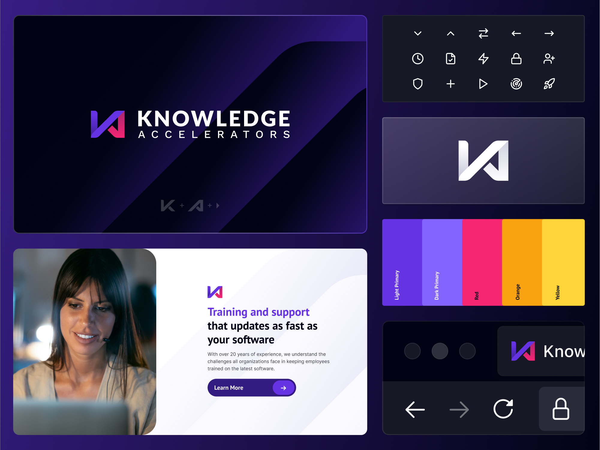
Knowledge Accelerators partnered with SmartAcre to revitalize its brand identity, transforming from a dated and inconsistent look into a bold, modern system. The refreshed branding introduces a dynamic logo, vibrant color palette, and cohesive visual standards that highlight the company’s speed, innovation, and commitment to continuous learning.
View Case Study
Before
- Legacy logo and visuals felt outdated and inconsistent, with limited flexibility across channels
- Color palette lacked distinction and did not align with the brand’s modern, tech-forward positioning
- Brand assets were minimal, making it difficult to maintain a cohesive identity across digital and marketing materials
After
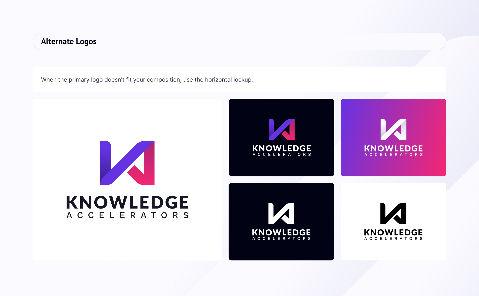
- Bold, modern logo that combines the “KA” mark with play-button and infinity symbolism to represent speed, innovation, and continuous learning
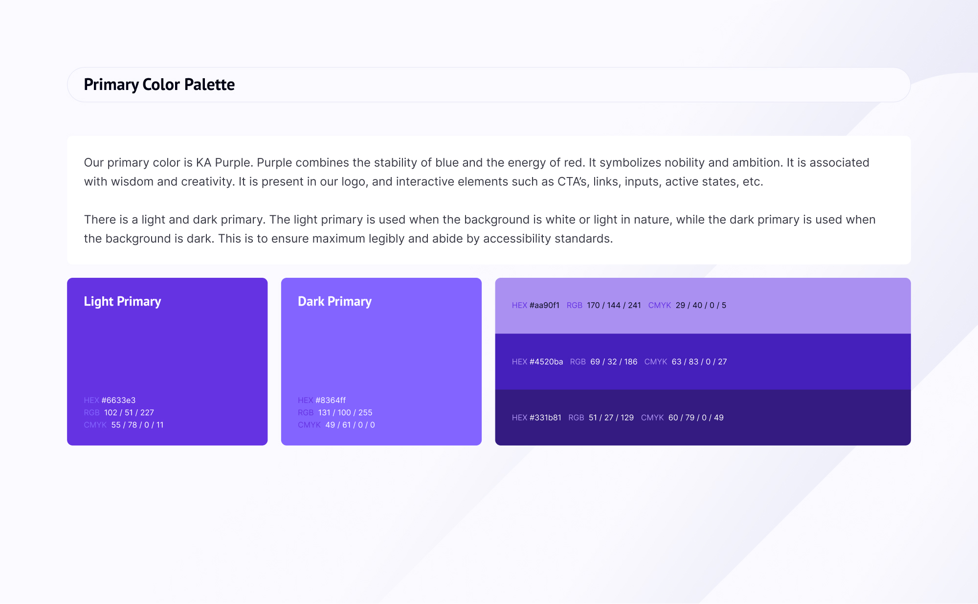
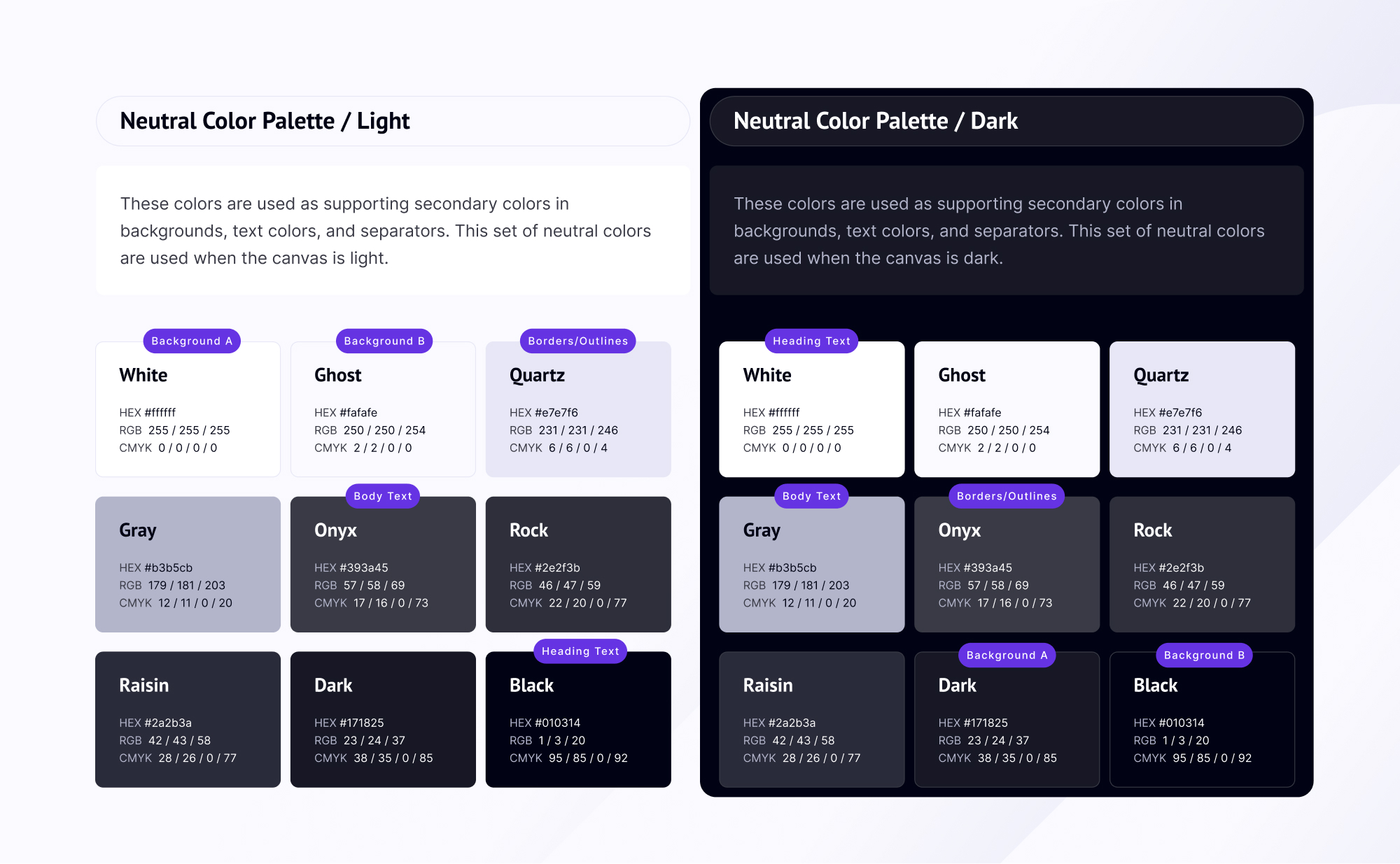
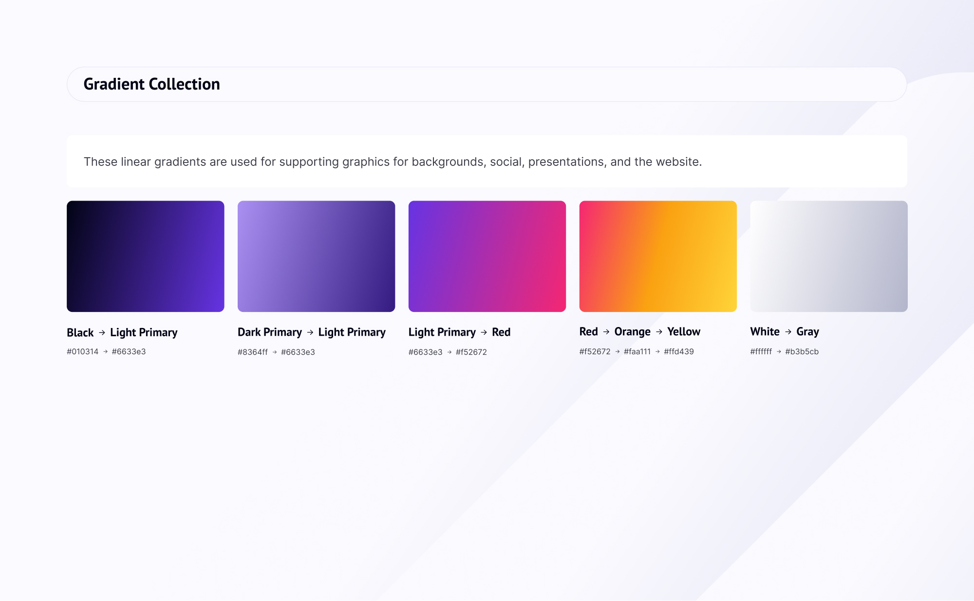
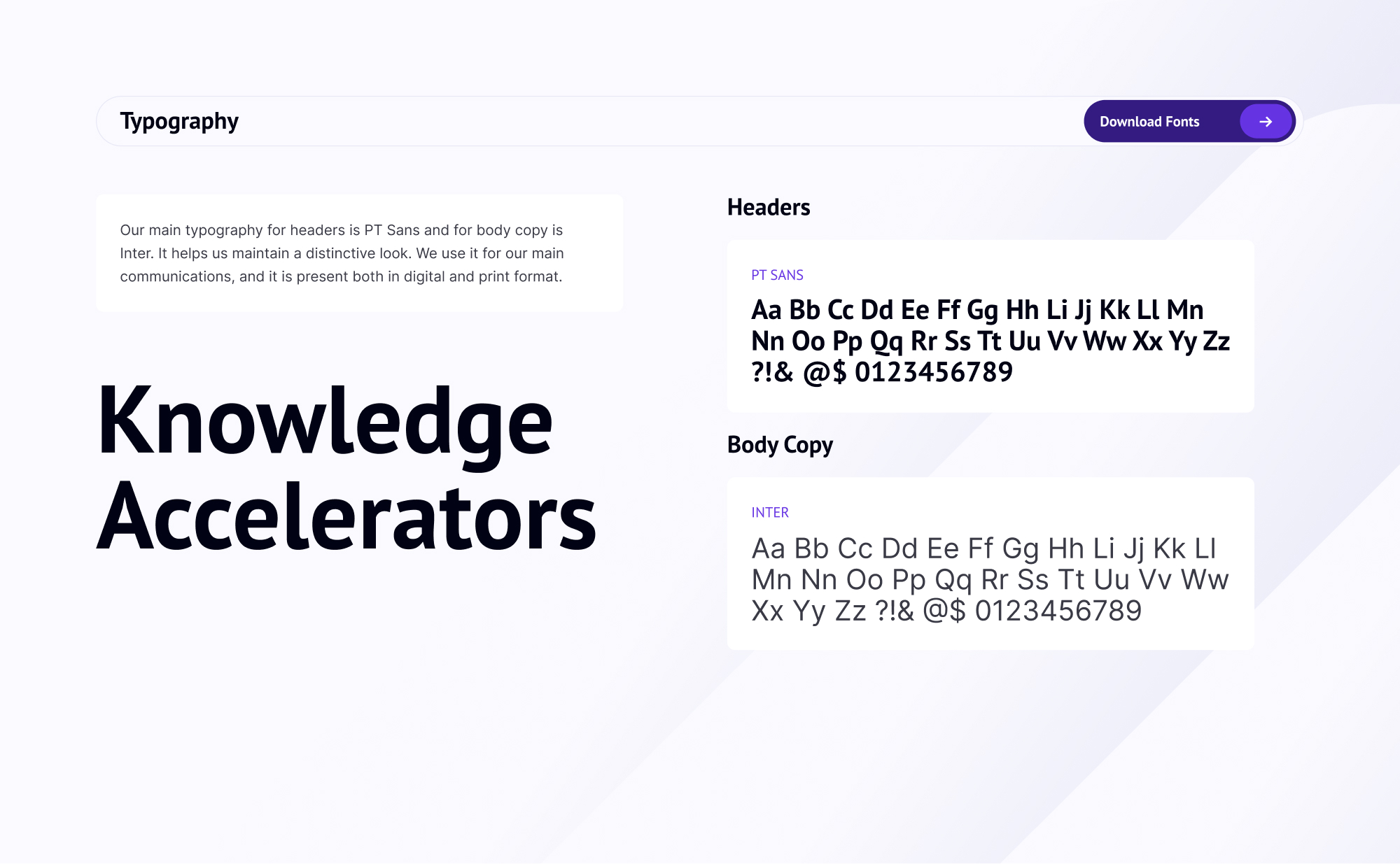
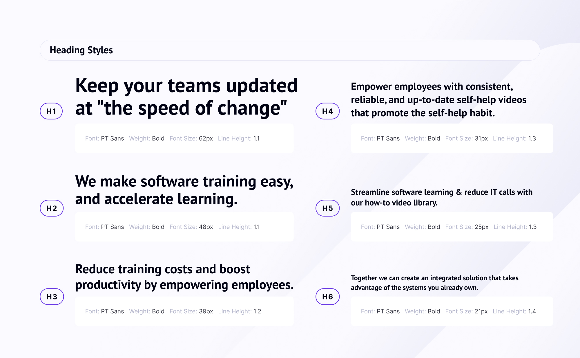
- Expanded brand system with a vibrant purple-led palette, energetic supporting colors, and accessible typography (PT Sans + Inter) for consistency across all touchpoints
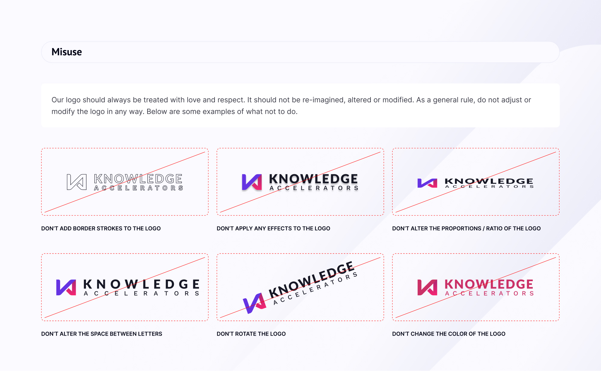
- Refined visual identity with clear guidelines for iconography, photography, and digital templates, ensuring cohesion and professional impact
Before
- Legacy logo and visuals felt outdated and inconsistent, with limited flexibility across channels
- Color palette lacked distinction and did not align with the brand’s modern, tech-forward positioning
- Brand assets were minimal, making it difficult to maintain a cohesive identity across digital and marketing materials

After
- Bold, modern logo that combines the “KA” mark with play-button and infinity symbolism to represent speed, innovation, and continuous learning
- Expanded brand system with a vibrant purple-led palette, energetic supporting colors, and accessible typography (PT Sans + Inter) for consistency across all touchpoints
- Refined visual identity with clear guidelines for iconography, photography, and digital templates, ensuring cohesion and professional impact


Before
- Legacy logo and visuals felt outdated and inconsistent, with limited flexibility across channels
- Color palette lacked distinction and did not align with the brand’s modern, tech-forward positioning
- Brand assets were minimal, making it difficult to maintain a cohesive identity across digital and marketing materials

After
- Bold, modern logo that combines the “KA” mark with play-button and infinity symbolism to represent speed, innovation, and continuous learning
- Expanded brand system with a vibrant purple-led palette, energetic supporting colors, and accessible typography (PT Sans + Inter) for consistency across all touchpoints
- Refined visual identity with clear guidelines for iconography, photography, and digital templates, ensuring cohesion and professional impact
