
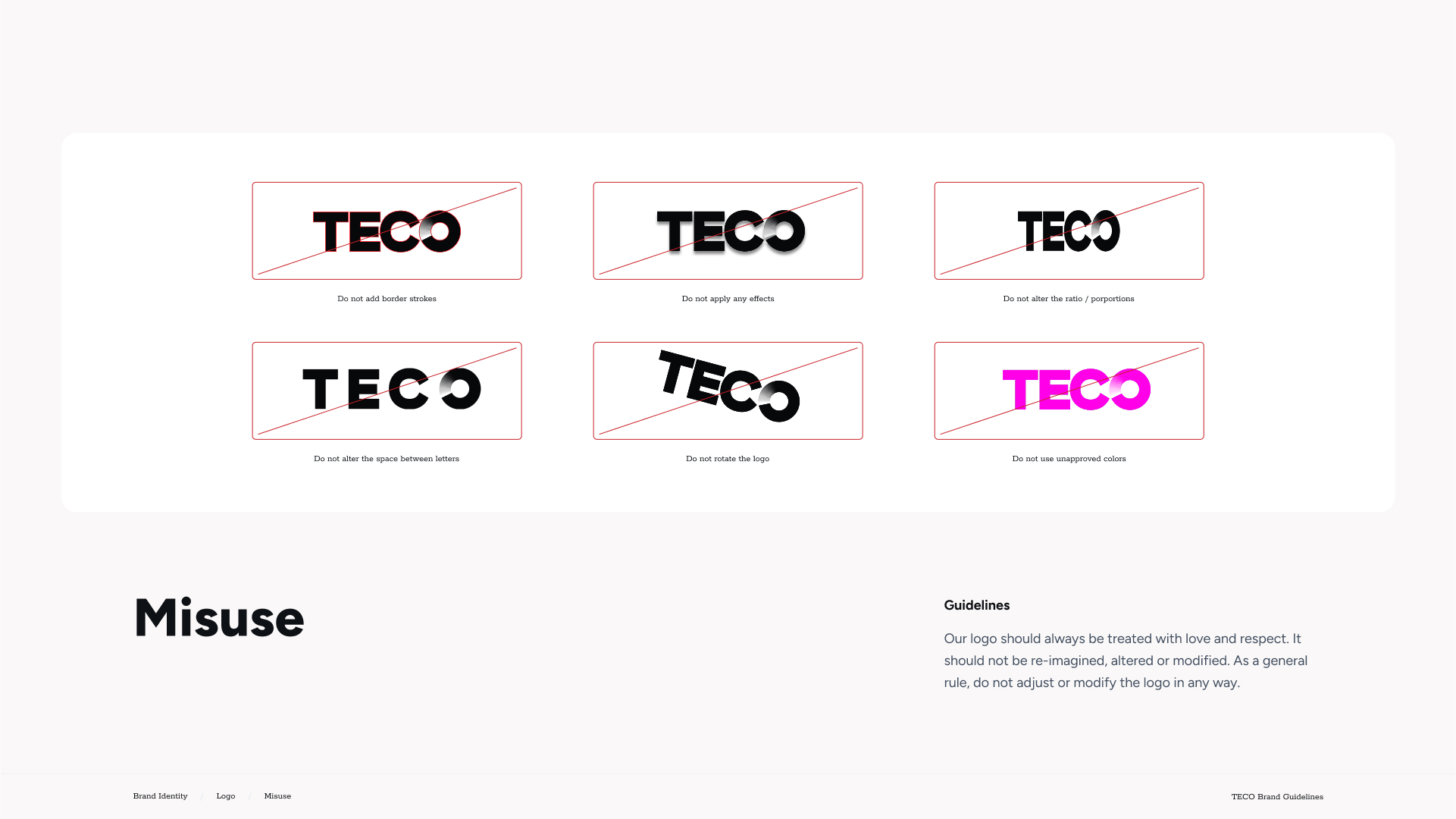
TECO Branding: Before and After
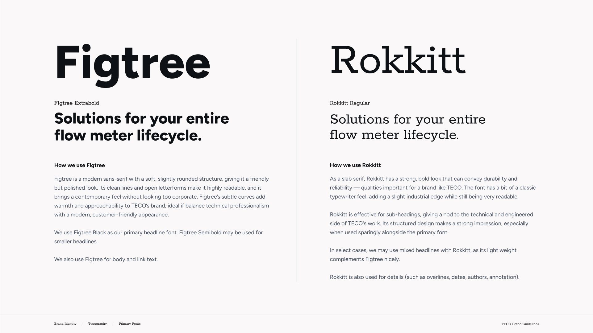
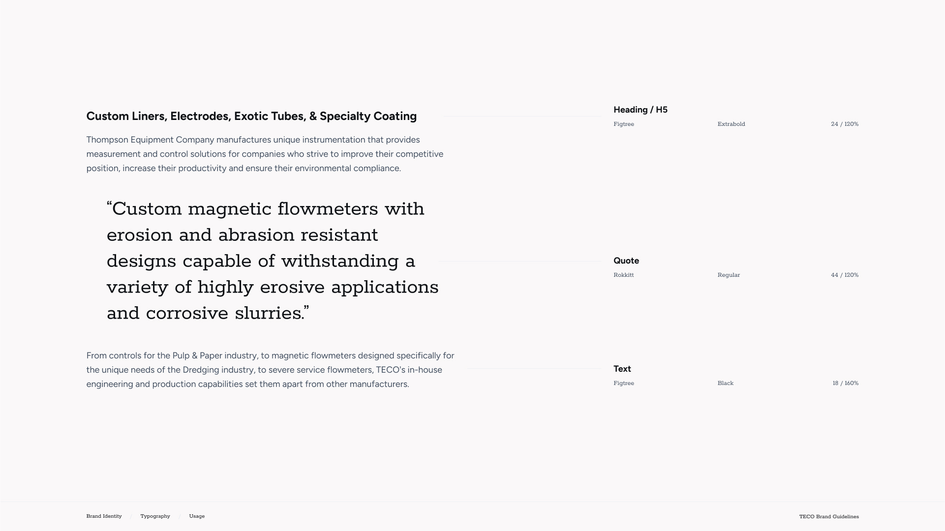
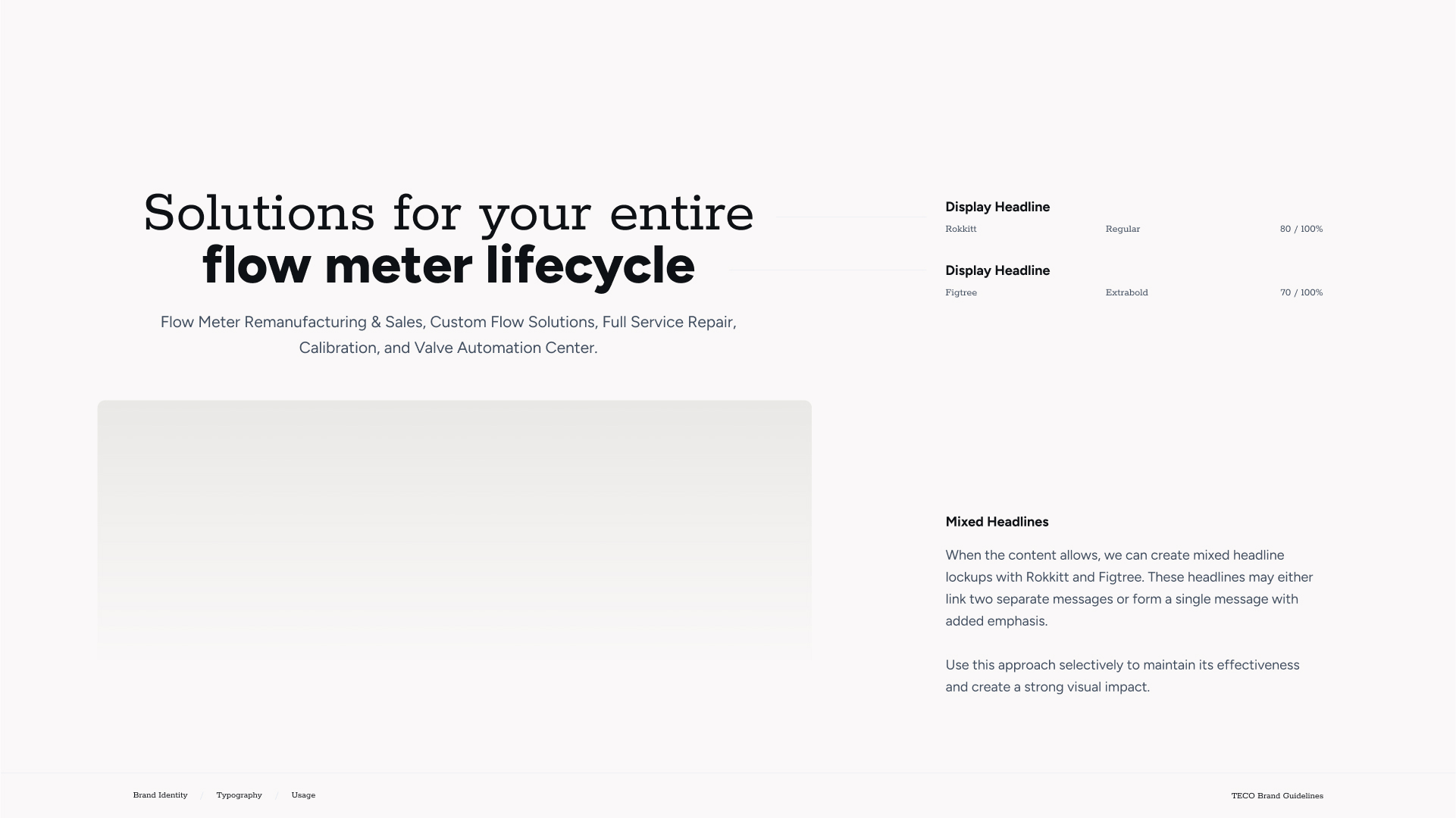
TECO partnered with SmartAcre to modernize its brand identity, evolving from dated and inconsistent visuals into a bold and cohesive system. The refreshed branding introduces a streamlined logo, defined typography, and an expanded color palette that capture TECO’s precision and innovation while strengthening recognition and trust across every channel.
![]()
Before
- Legacy logo and visuals that felt dated and inconsistent across applications
- Limited color system and typography that did not convey a modern, cohesive identity
- Brand assets lacked versatility, making it difficult to maintain consistency across channels
After
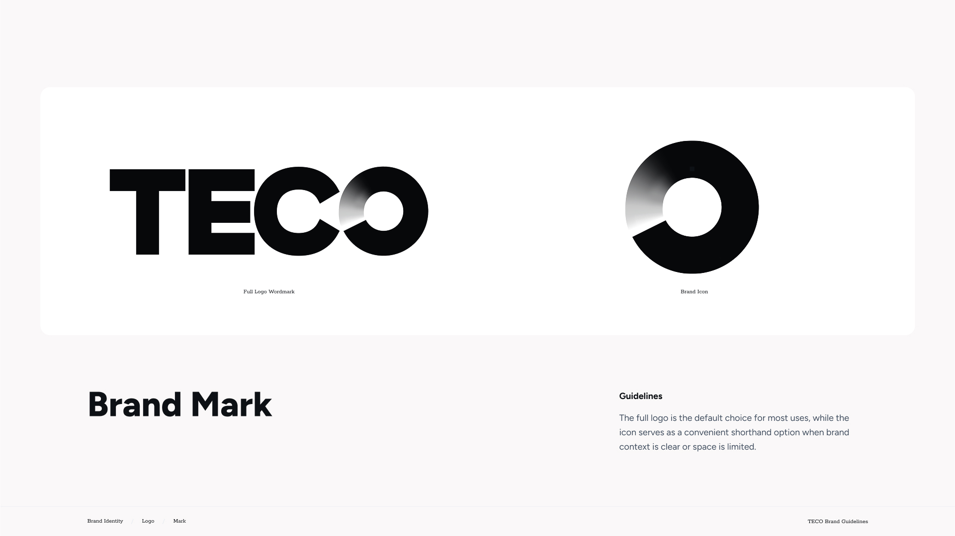
- Modernized logo with a bold, clean design and visual representation of flow to reflect TECO’s expertise
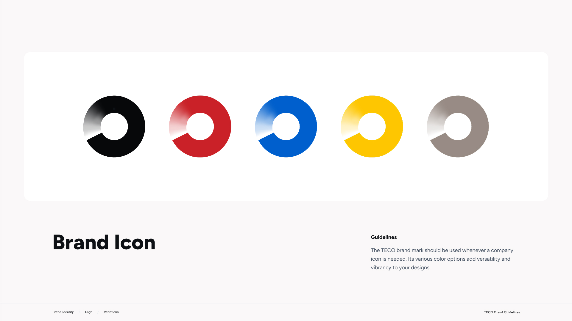
- Expanded brand system with defined colors, typography, and iconography for a cohesive and professional identity
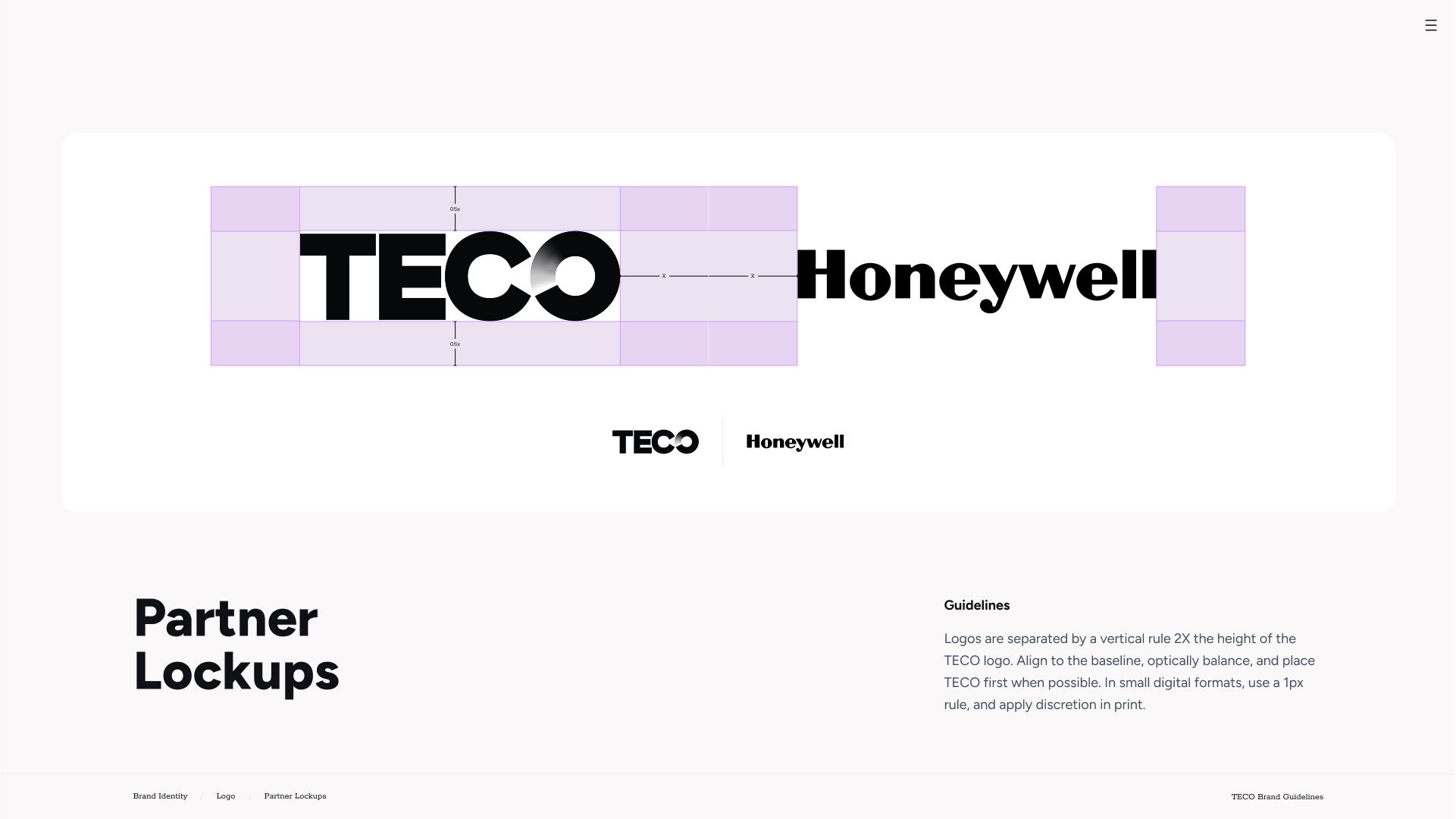
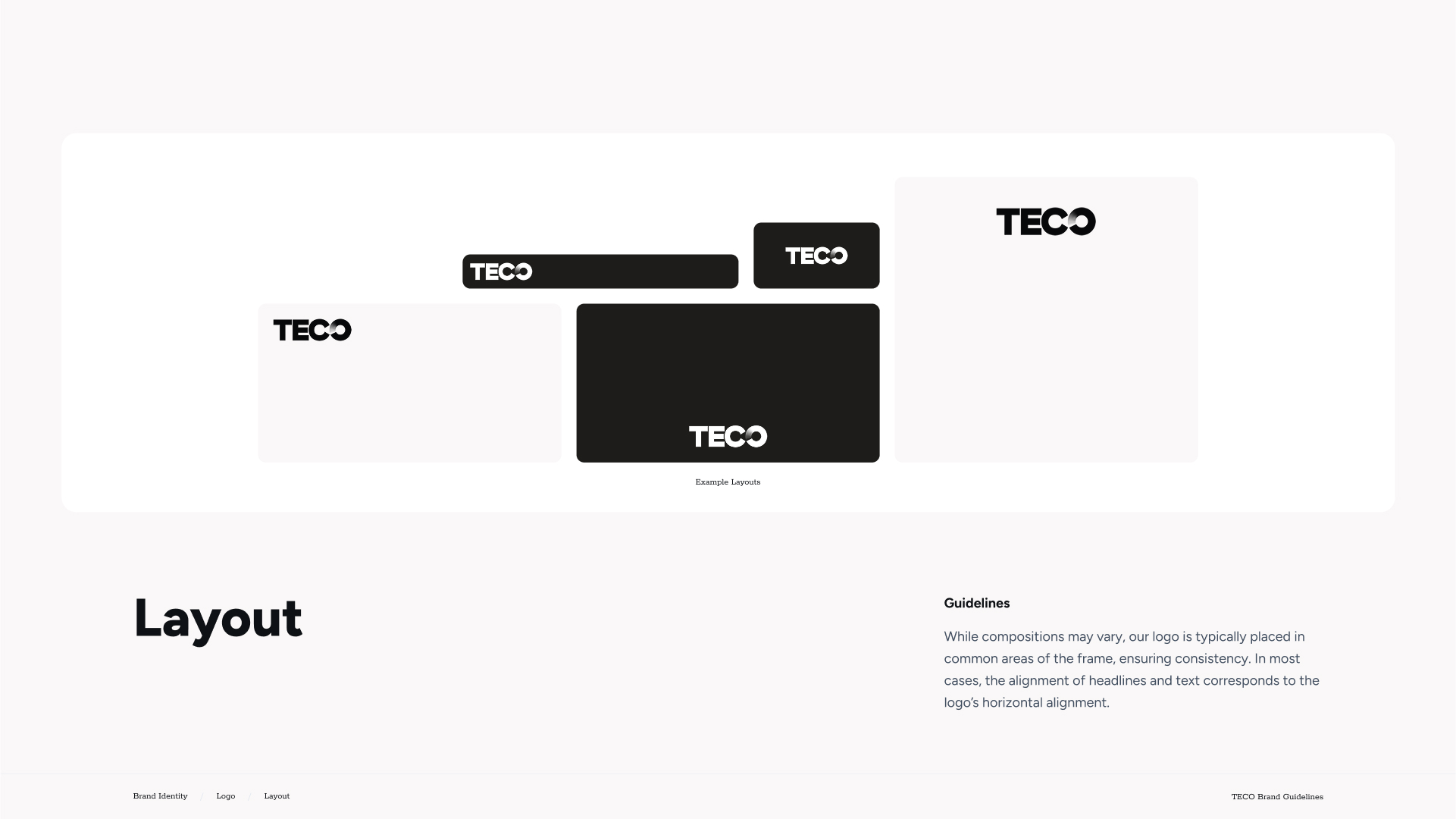
- Flexible guidelines for photography, layouts, and design elements that strengthen recognition and trust
Before
- Legacy logo and visuals that felt dated and inconsistent across applications
- Limited color system and typography that did not convey a modern, cohesive identity
- Brand assets lacked versatility, making it difficult to maintain consistency across channels
After
- Modernized logo with a bold, clean design and visual representation of flow to reflect TECO’s expertise
- Expanded brand system with defined colors, typography, and iconography for a cohesive and professional identity
- Flexible guidelines for photography, layouts, and design elements that strengthen recognition and trust