
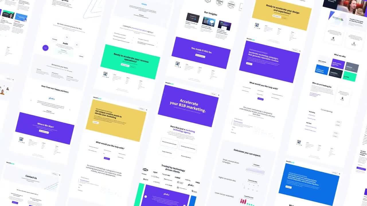
Design & Experience | Brand
SmartAcre Rebrand
Expertise
Industry
Tactics
Overview
Our proven methodology is designed to include marketing best practices, user experience, online visibility, and smart development.
Staying true to our methodology, we utilized our knowledge and expertise when updating our brand to reflect our forward-thinking mindset and future goals. Our mission is to create an agency that truly cares about our people and clients and it was time for it to be represented within our brand messaging. The update also provided the opportunity to showcase the agency’s branding capabilities from logos, color palettes, iconography, style, presentations, messaging, and everything in-between.
Challenge
A number of ideas were discussed at the project’s onset. We knew that we wanted to stand out a bit more boldly and to do that, our brand needed to be updated to be punchier and more energetic. But still, rebranding is never easy. Overwhelm is typical, especially when it comes to changing the feel, logos, fonts, colors, and everything else involved. Ultimately, after many iterations of the logos, colors, and other elements that define a rebrand, we came up with an outstanding vision that truly encompassed who SmartAcre is, what we do, and why we do it.
![]()
Approach
Brand Strategy
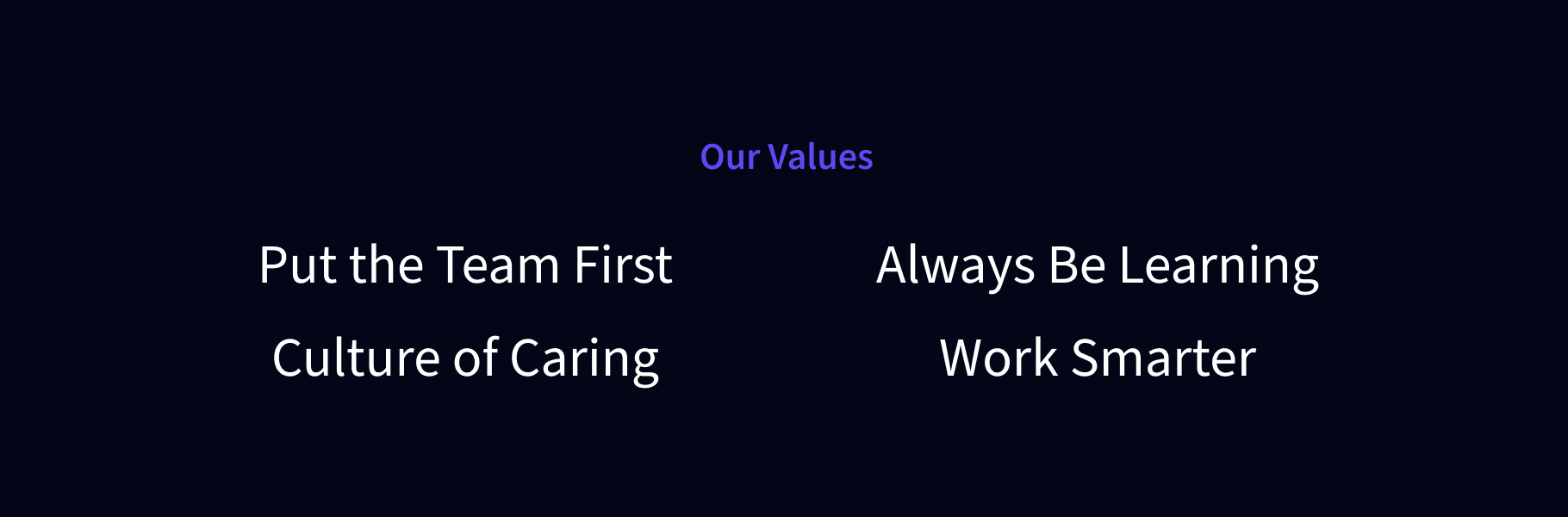
Our brand strategy puts forth our 4 core values:
- We always put the team over ourselves.
- We have a culture of caring. We care about what we do, our peers, and our clients, every single day.
- We strive to always be learning. We invest in ourselves and carve out time to learn, grow, and get certified.
- We also work smarter. We know the work is never done but it doesn’t always have to be at our desk. Prioritization is our superpower.
Logo
SmartAcre’s logotype is custom-built with readability in mind. Our primary horizontal logo is the touchstone of our brand and one of our most valuable assets. The A represents our mark, our symbol, and our logo. Made up of diamonds and triangles, the diamonds shine bright like our SmartAcres do while the triangles are a homage to our roots and previous branding. Together, they make an upward motion that shows growth. The colors are used to show transition and are bright and punchy to convey our energy. The use of a gradient to blend the colors was intentional, as it represents the connected nature of the departments within our agency.
![]()
![]()
![]()
Visual Language
Our visual language, characterized by bright, bold colors, aims to grab attention and create a memorable impression. It exudes energy, vibrancy, and a modern feel, appealing to individuals seeking excitement and a visually stimulating experience. Our main color, SmartAcre® Purple, expresses authenticity and high quality, while our SmartAcre® Blue represents loyalty and respect, and our SmartAcre® Green supports tranquility and nature.
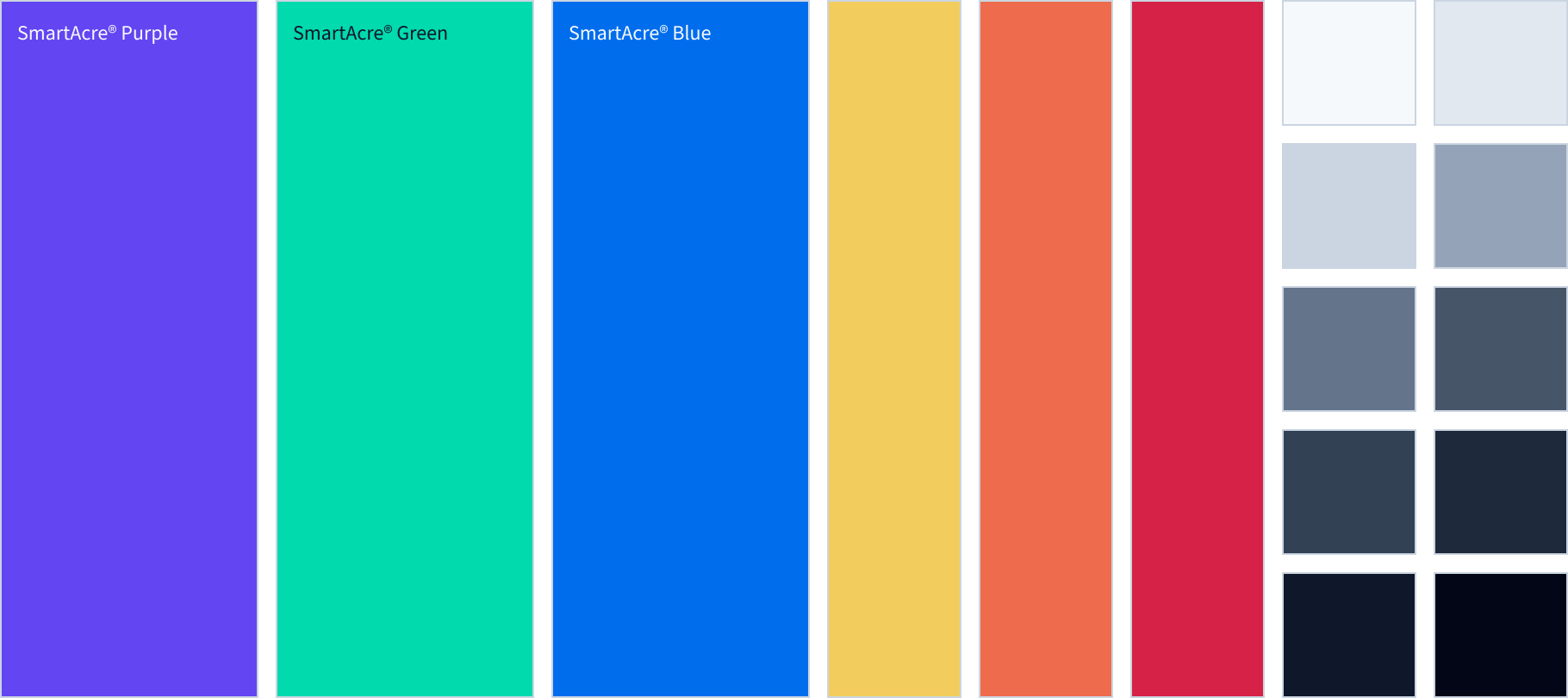
Secondary palettes are reserved for backgrounds, separators, models, charts, and small elements.
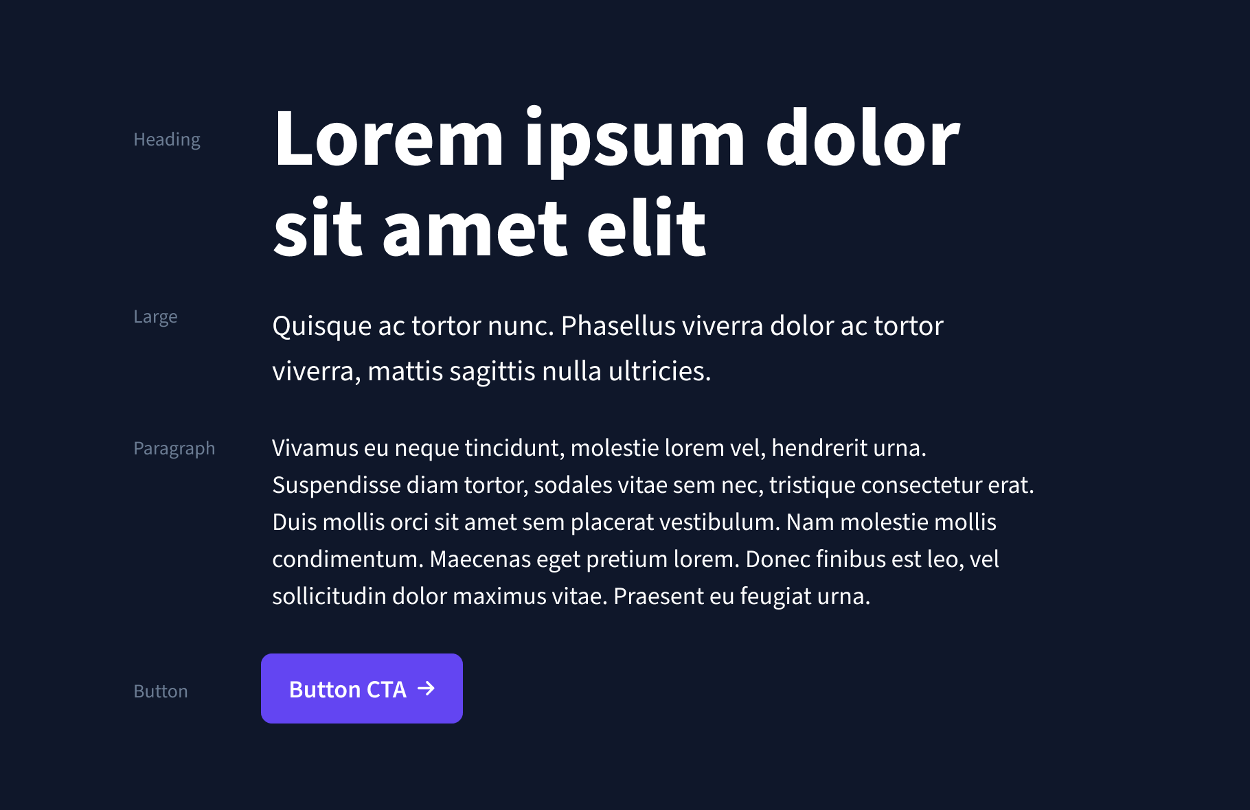
Typography
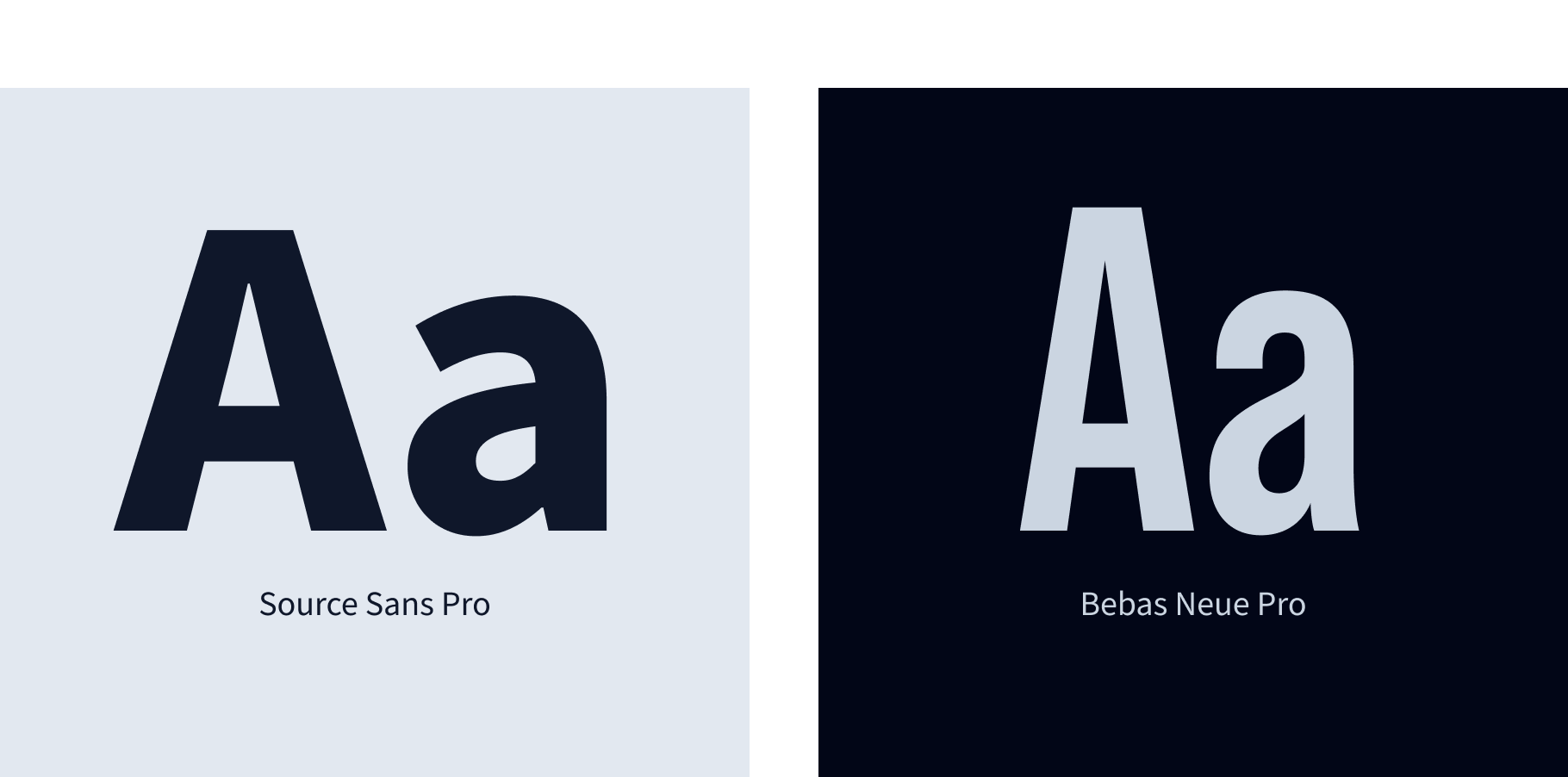
SmartAcre utilizes the Source Sans Pro font family as our primary typeface, our workhorse for headings and body copy. Our secondary typeface is the Bebas Neue Pro font family which is used sparingly on creative assets (such as social ad posts and print collateral).
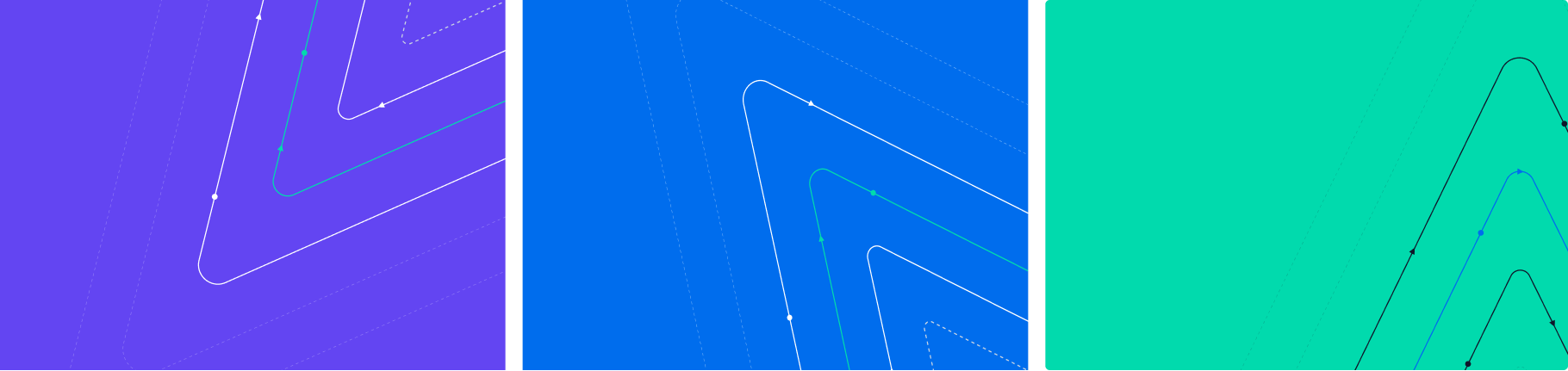
Pattern
The SmartAcre® patterns add an authentic and human quality to the brand. These outline the SmartAcre mark and add visual interest to large color blocks and photography.
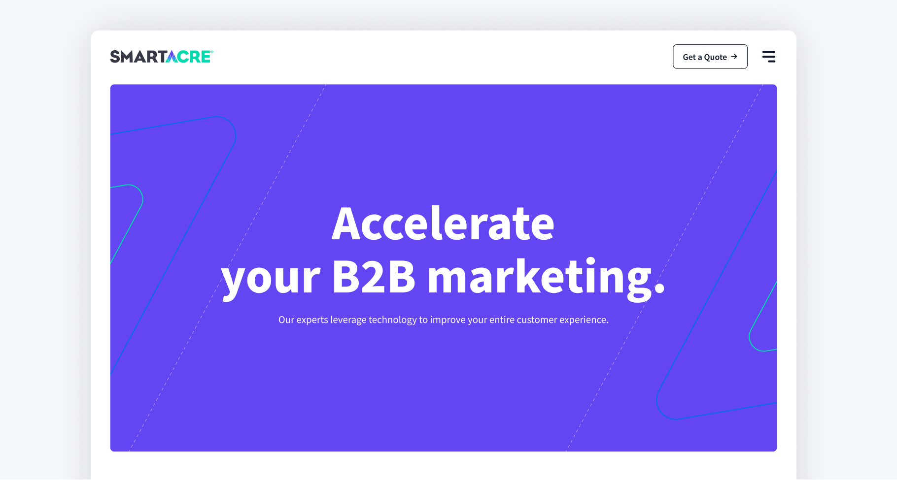
Interactive
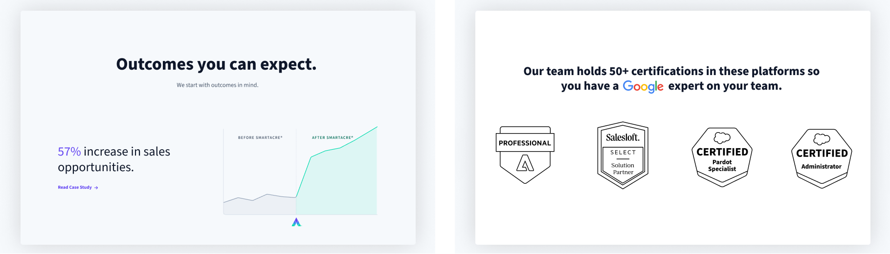
We help B2B companies leverage marketing and sales technology to improve the entire customer experience. Therefore, it was only appropriate to match our philosophy and methods to our own website. Taking all of the visual language within our brand, we built each page to illustrate who we are, what we do, and how we can help you achieve your goals.
Outcomes
52.52%
Increase in Website Sessions
66.47%
Increase in Website Users
30.95%
Increased in Website Page Views
*Comparing May 2021 (pre-rebrand) to May 2022
![]()
“What truly makes our brand? Our SmartAcres. A group of smart individuals who are greater when we come together to make an impact each and every day.”
Lisa Zwikl
Chief Strategy Officer
Post-Project Success
As the new branding rolled out, we received positive feedback from our clients who loved the bold, bright and eccentric style.
Most importantly, we now have a brand that accurately represents who we are: a connected team that brings forward momentum to our clients and their projects, is excited and energetic about the work we do, and is focused on growth. And, we are able to showcase our branding capabilities to prospects and clients as an example of how we can help them reach their goals.
Related Case Studies
Investment Metrics Rebrand
Our primary goal was to modernize the client's appearance to set them apart from competitors, while also improving the user experience and driving more qualified leads.
Redsson Rebrand
Our primary objective was to simplify and rebrand Redsson's identity and streamline what they offer their clients.
One10 Marketing Playbook
One10 partnered with SmartAcre to create a Marketing Playbook, empowering their marketing team to execute campaigns strategically, align with sales, and enhance multi-channel engagement.
Where We Start
Book a strategy session and we will discuss your unique challenges. For free. Maybe one day you will have a success story to add to this page.