
Is Your Website Accessible? Design Considerations (Part 1)

Summarize this insights post with:
A look at design considerations to keep in mind when determining if your website is ADA Compliant.
What is ADA Website Compliance and why should I care?
In its simplest form, ADA Website Compliance is ensuring that your website adheres with WCAG 2.0 AA (or, even better, 2.1 AA) so that web visitors with disabilities have equal opportunities to view your website content, resources, and products that you have to offer.
Why is Web Accessibility important?
Simply put, you do not want to have an ADA Website Compliance lawsuit on your hands. But, not to fear – we have put together a simple way to make sure your site is up to par with the leading standards. We’re kicking off this series by focusing on Design standards first, but we’ll share more on Web Development and Content standards to consider, as well.
1. Color & Color Contrast
One of the most important contributing factors to website accessibility is the use of color. Color should not be used to convey something, solely. For example, if you hover over a hyperlink, it should not only change from blue to purple, but should also include a “decoration,” such as an underline, a highlight, or another clearly identifiable element.
To dig deeper, color contrast also plays a significant role, especially the color of any given text and the background. Any text that is over 18pt must have a contrast ratio of 3:1, while any text that is under 18pt must have a contrast ratio of 4.5:1.
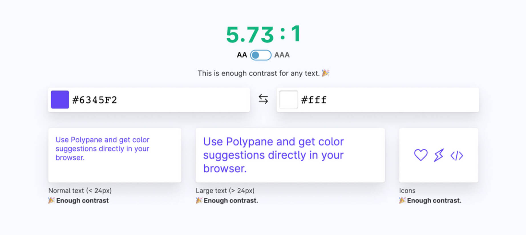
How do I calculate website color contrast?
Using Polypane, you can find out the ratio with just two colors: the font color and the background. The image below shows an example of acceptable contrast between the text and background. You can check to see if your brand colors are compliant for the web, or if they need some tweaking – and this color contrast checker even gives you suggestions if it does not meet the standards.
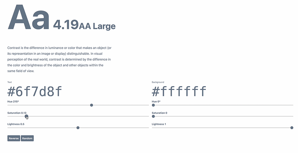
How can I find a suitable color?
So, you used Polypane and the ratio wasn’t in line with AA standards, but you don’t like their suggestions. Now what? You can take the next step and visit Colorable to input your text color and background color again. By sliding the saturation or lightness slides under the text fields, you will get a compliant hex # that will be ADA-compliant for your website.
2. Text Spacing
These standards are more in line with design best practice principles. If it doesn’t look pleasing or is hard to read in general, it is most likely not up to ADA standards.
The line height, or line spacing, should be at least 1.5 times the font size
Spacing following paragraphs should be at least 2 times the font size
Letter spacing, or tracking, should be at least 0.12 times the font size
Word spacing should be at least 0.16 times the font size

3. Focus State
A focus state displays when a user has highlighted an element using a keyboard or voice. Focus states apply to all interactive components on your website. If you’ve ever tabbed through a website or used voice search, you may have noticed outlines around major elements like buttons or links.

Focus states should be obvious when activated. Since this begins to overlap with the development stage of a web design, it’s important to design for this as well so that it fits within your brand.
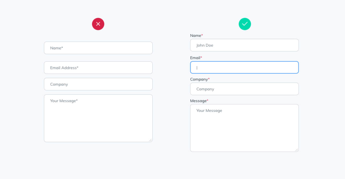
4. Web Form Design
If you view a form right out of the box from bootstrap, you will notice there’s not much to look at: styling is minimal and not very pleasing to the eye. Nevertheless, all the elements are set in place already to be accessible. It’s important to keep form design and styling in mind when considering web accessibility, as what may appear to be more aesthetically pleasing may result in poor compliance.
For example, removing labels and only providing placeholder text inside of a field does not give web accessibility readers the access they need to provide a compliant output to visitors.
Your four checkboxes for design-based web accessibility
To recap, there are four main areas to consider when reviewing your website design for ADA Web Accessibility:
- Color and Contrast
The use of color is one of the most important factors contributing to website accessibility. With Polypane, you can determine the ratio with just two colors: the font color and the background color. - Text Spacing
Design best practice standards are better aligned with these standards. In general, if it is difficult to read or does not look pleasing, it most likely does not meet ADA standards. - Focus State
When focus states are activated, they should be evident. In order to make this fit within your brand, you should design for this as well, since this overlaps with the development stage of a web design. - Web Form Design
When considering web accessibility, it’s important to consider form design and styling. A form that appears to be more aesthetically appealing may not always result in high compliance.
In the next part of this series, we’ll take a step further to look at the web development of an ADA-compliant website.
If you want to learn more about web-accessible design or ADA-compliant websites, reach out to us for a deeper dive and consultation on how we can assist with making sure your website is accessible moving forward.
Part 2 of Is Your Website Accessible? Content Considerations.
Get your website accessible today!