
Landing Page Design Success vs. Failure

Summarize this insights post with:
The importance of a well-thought and conceptually designed landing page can be the difference between a successful conversion and a failed campaign. Studies have shown that email campaigns that opened with promise and decent click ratios died on the vine with ill-conceived, poorly designed, and just plain lazy-ass landing pages. Bored, confused prospects quickly took their conversion clicks – and wallets – elsewhere. A smart marketing strategy needs smart landing page design.
Let’s start with the basics
What is a landing page?
- Web Developer’s standpoint: A landing page that consists of the same basic elements as any other web page (HTML, CSS, content copy, images, video, etc.).
- Marketer’s standpoint: A web page that asks users to perform a specific task such as purchasing a service or product, or taking an action like subscribe. Other goals include lead generation, branding, and awareness.
- User standpoint: A page seen after clicking on a hyperlink on another site.
Different standpoints lead to different definitions of what a landing page is. This post from HubSpot does a good job of explaining what a landing page is NOT.
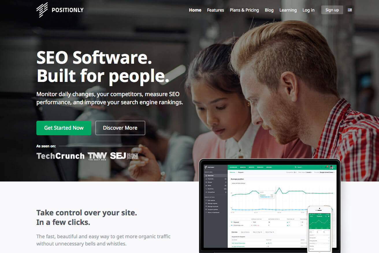
Is your landing page getting the ugly sister treatment?
Now that we are clear on what a landing page is, let’s talk. There are many elements that make up an effective landing page like smart development and good content, but right now let’s think about the important design elements that go into a landing page that looks good AND is effective.
Know your target audience
Before you can even design, you must know who you are targeting and why. Putting yourself in the users perspective will help easily visualize how and what their experience should be.
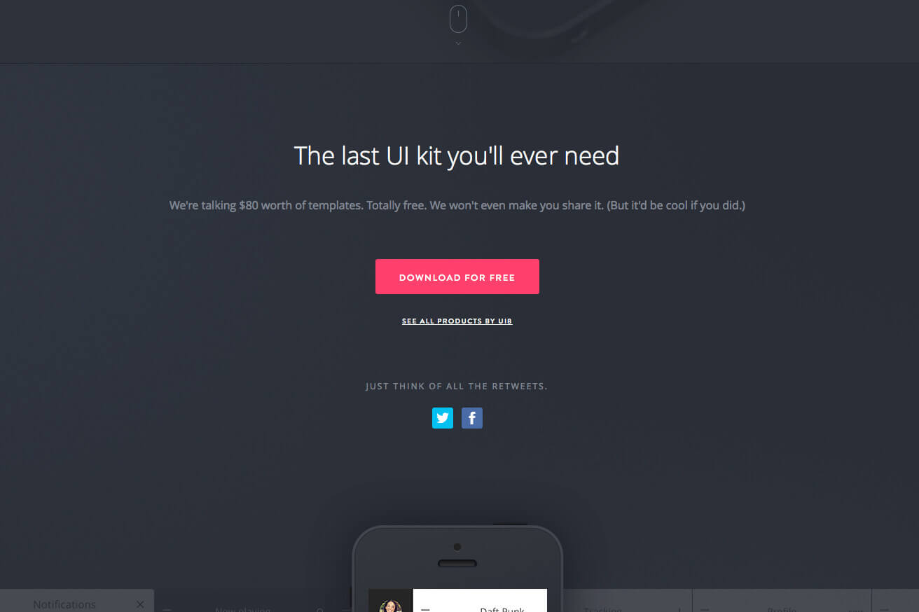
Write a powerful headline
Any page, especially a landing page, needs an effective and powerful headline. The headline sums up and prepares the user for what is to follow. They let the user know they are in the right place and keep them there.
- Keep headlines sweet, short, and direct: Time is money, on both ends, so give the user an idea of what to expect and what they can gain from the landing page.
- Design for attention: A headline should be one of the first things users see, so a well-designed headline should grab the users attention and establish the site design. Direct copy plays into this.
- Don’t forget about SEO: Using HTML header elements (such as <h1> and/or <h2>, Images, etc.) can help search engines index the keywords and content of the page better. Using keywords will allow users to find the landing page on search engines more frequently. Don’t write headlines for search engines, but do consider SEO.
Include a specific call to action
A call-to-action clearly asks a user to take a specific and desired action. This is often a hyperlink or button. From a design perspective, this element should be well thought out and prominent.
- Be clear and straightforward: Be clear and concise on what you want the user to do.
- Use call to action sparingly: No on likes to be screamed at; your landing page should reflect that. By strategically placing and limiting your call to action, you can focus on getting users to perform a desired action as quickly as possible.
- People love to click buttons: A well-designed button can draw attention and urge to click. Use conventional UI, User Interface, Controls to entice the user to click elements such as containers, arrows, etc.
- Guide them: Users need a small push to perform an action. Supporting information that encourages users to perform a desired action is key for impressions and conversions.
Keep it simple
Simplicity is key. A landing page should be easy and seamless to navigate, read, and find information. It should never be complex. A good rule of thumb? K.I.S.S (Keep It Simple Stupid).
- All elements on page should push the desired action: Thinking “Less is More” can help eliminate needless elements and copy. Focus on the task at hand and guide the user to the overall goal.
- Only one primary call-to-action: Establish the landing page objective, and figure out the action you want the user to execute. The primary call-to-action should be distinctive and noticeable.
- Negative space is your friend, use it: If the landing page feels like a cluttered and cramped mess, users will feel accordingly. Visually, it will intimidate users. White/negative space gives users an opportunity to allow their eyes to rest and “breath,” use this to your advantage to create “user eye-flow.”
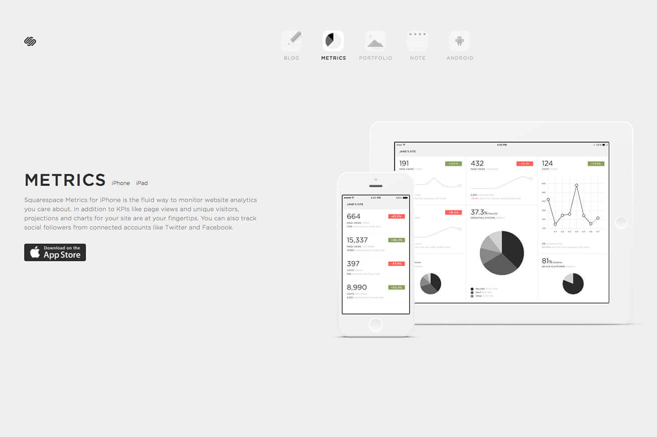
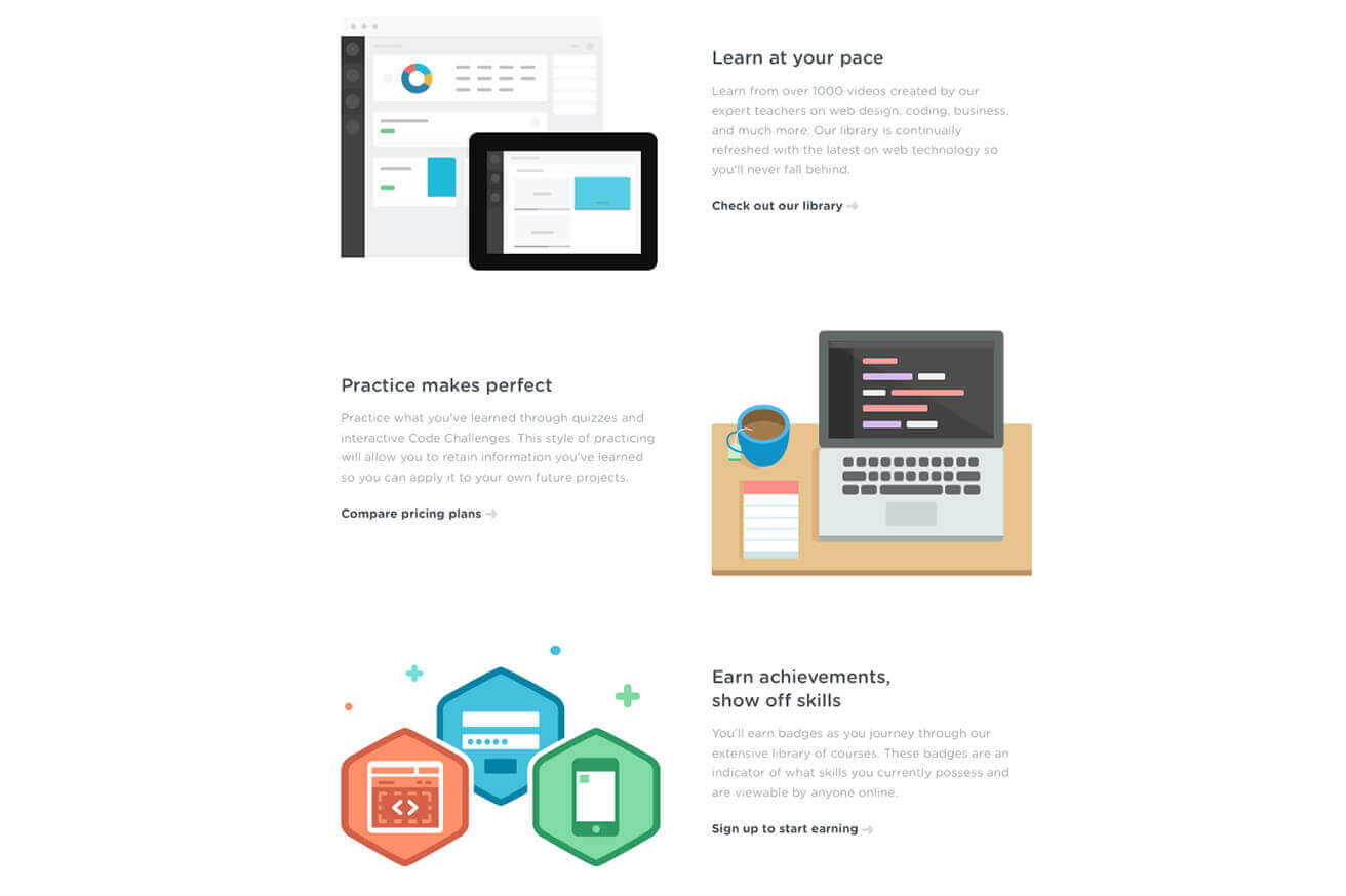
Tell a story through layout
A well-thought out layout will ensure that all important landing page elements are given the correct attention. This will help the user make the decision to take your desired call-to-action. Like any good story, the goal is to keep the user—or in this case the reader—informed, intrigued and apprehensive for the end; the desired call-to-action.
- Visual hierarchy: Establish which elements are most important and highlight them accordingly, use supporting elements or sections to compliment your most important pieces
of the landing page. - Take advantage of graphical elements: Eyes like to wonder, so using graphical elements such as arrows, icons and attractive images will help direct attention towards desired areas of focus.
- Use color: Take advantage of color, using high-contrast color on certain elements will demand desired attention. A great color palette will create an overall satisfying feeling. Research has reinforced the importance of color, about 60 percent of the time people will decide if they are attracted or not to a message based on color alone!
- Think about pacing: Pacing is the forward movement of your story in a smooth and “digestible” manner. Not everyone wants a race to the end of a story and vice versa. Tell your message in a matter that is exciting and quick, use images to better convey or compliment parts of copy, break up typical linear grids to add variety, and overall make it fun and exiting. If you—the designer—cannot sit down and read through your own design, then neither will the user.
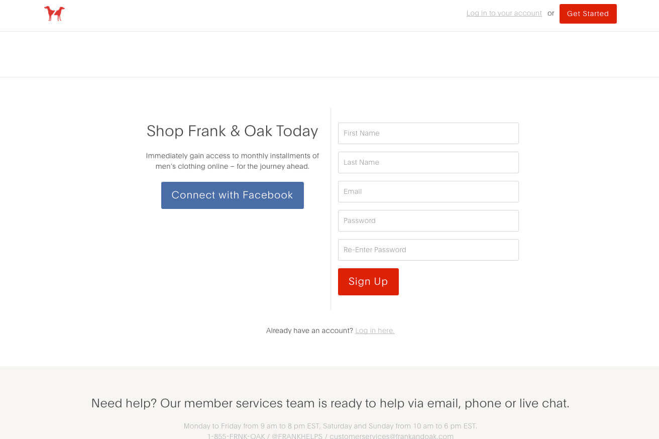
Consider form structure
Although simple, the structure of a form effects a visitor’s perceived notion of value, risk, and even credibility. A well-designed and prominently displayed form will prevent confusion.
- Welcome with grace: The form design should be inviting, simple, and direct. Avoid using overly designed inputs and focus on simplicity and cross-browser compatibility.
- Create a flow: Structure the form inputs in a matter that is easy to follow. Stacking inputs allows the user to fill out the form in a checklist matter and creates focus, avoiding the eye from bounce from place to place.
- Entice the clicks: As suggested in the “call-to-action” section, make it apparent where and how to submit the information. Make the submit button appealing and distinct.
Conclusion
The design of a landing page is beneficial to any marketing strategy. It entices the user to try, buy, visit, or learn more about a product or service. A well thought out strategy and conceptual design is more effective than just a “pretty” page. Thinking through key elements and focusing on the importance of the page can impact your desired conversion goals.
Noticed a creative and effective landing page recently? We’d love to check it out. Share, comment, and leave your link below.